

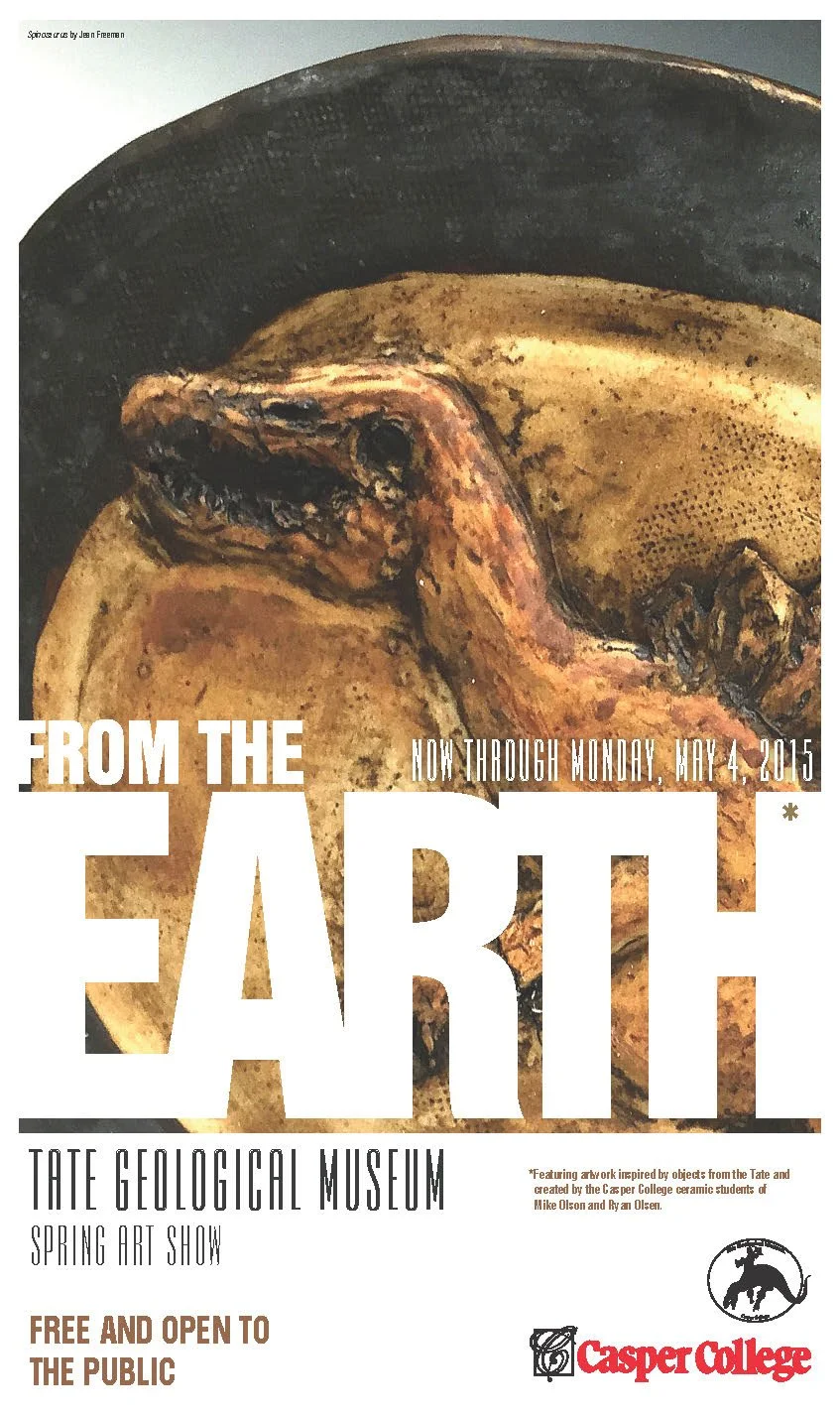
This design is from 2015, but some things in design haven't changed.
For this job, one of the first things I had to consider was not the typography or the image. It was the production.
This piece was going to printed in-house on a standard printer, which meant it could not achieve a traditional full bleed. I knew there would be a white edge around the piece. Instead of fighting the limitation, I made the white space part of the design. The border became intentional rather than looking like something the printer could not reproduce.
Then came the art and typography.
The artwork needed to be the focus, after all this is for an art event. The typography needed to guide the eye through the piece, grabbing the attention with the title "From The Earth," then moving the viewer into the event information and ultimately the details for attendance.
The goal was to keep it simple and let the artwork do much of the educating and enticing. Over then years later, the tools we use have changed considerably. The fundamentals really haven't.
Understand the constraints.
Know what needs to be communicated first.
Guide the viewer.
Make every design decision have a reason.
And remember sometimes a limitation can even become part of what makes the design work.
From The Earth
Previous
Previous