A design should not stop working when you leave the poster.
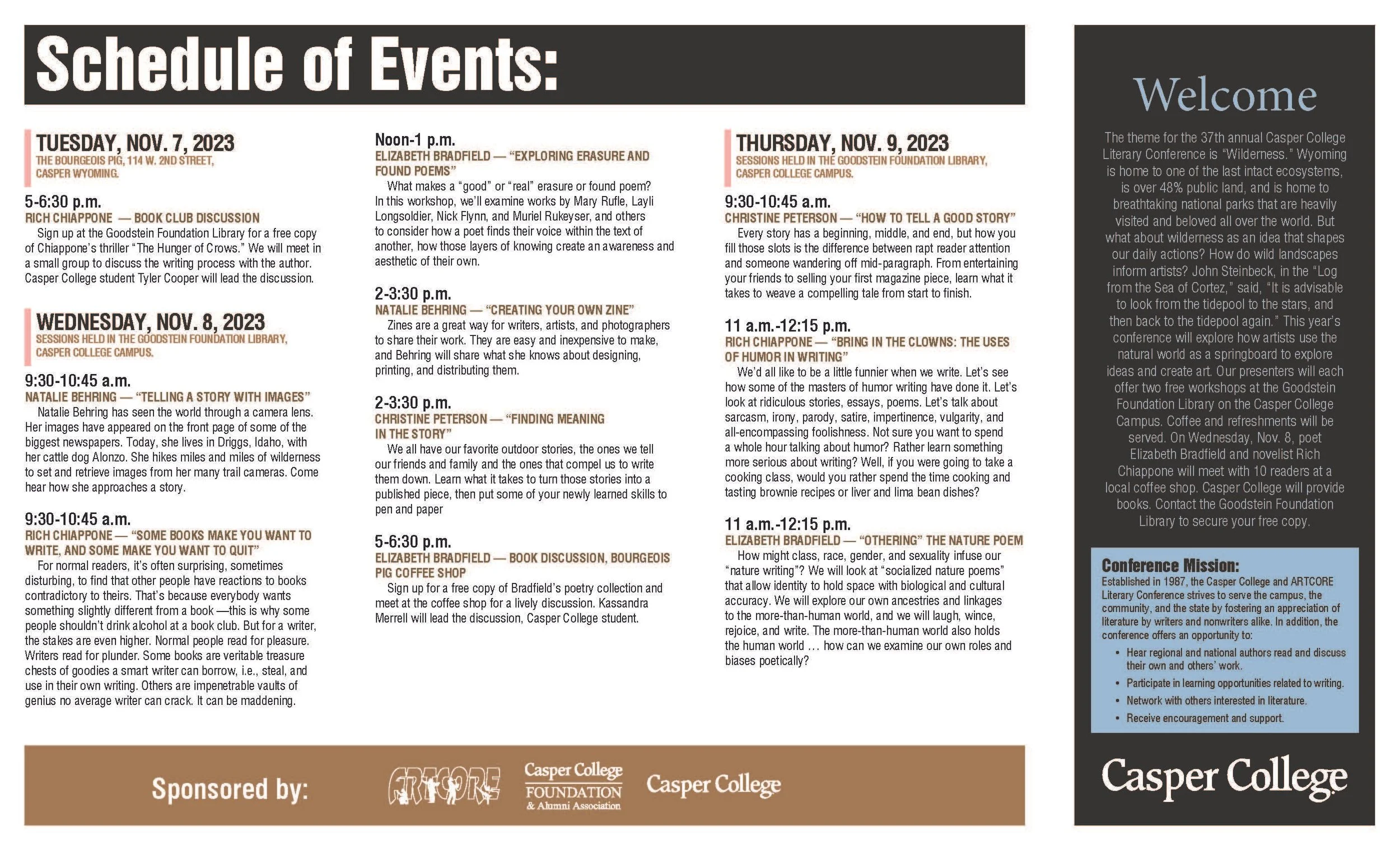
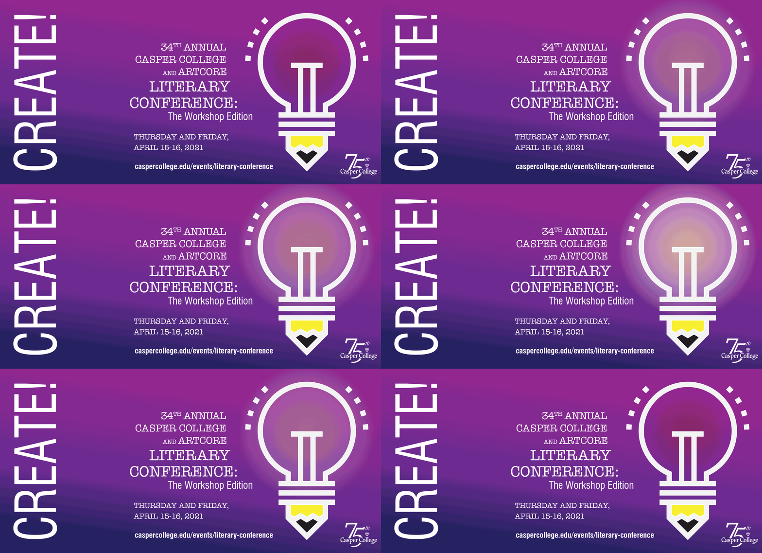
This conference is for writers, readers, and those interested in the literary arts. There are workshops, speakers, and readings during the days of the event. Each year has a theme, 2021 was create.
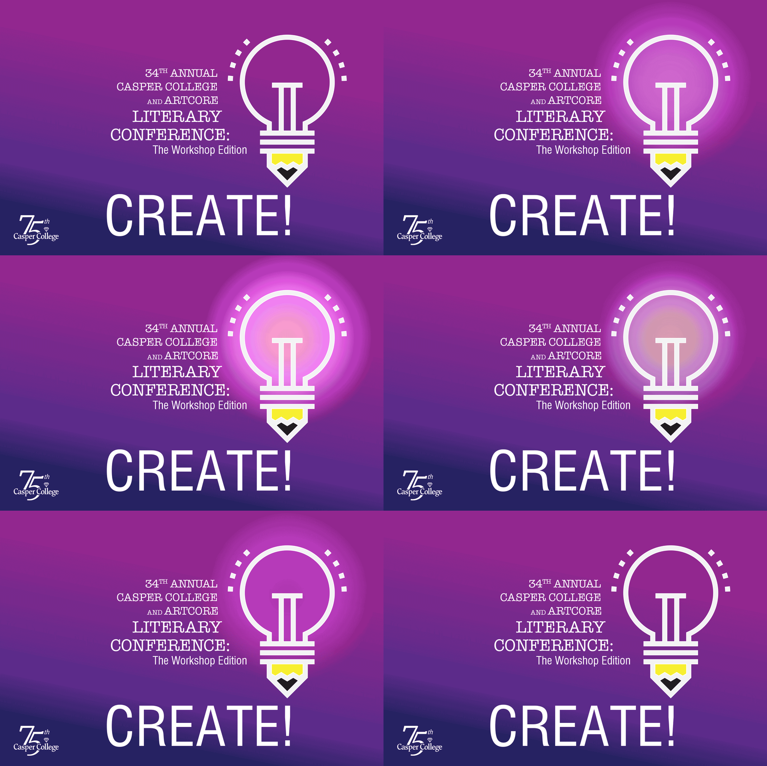
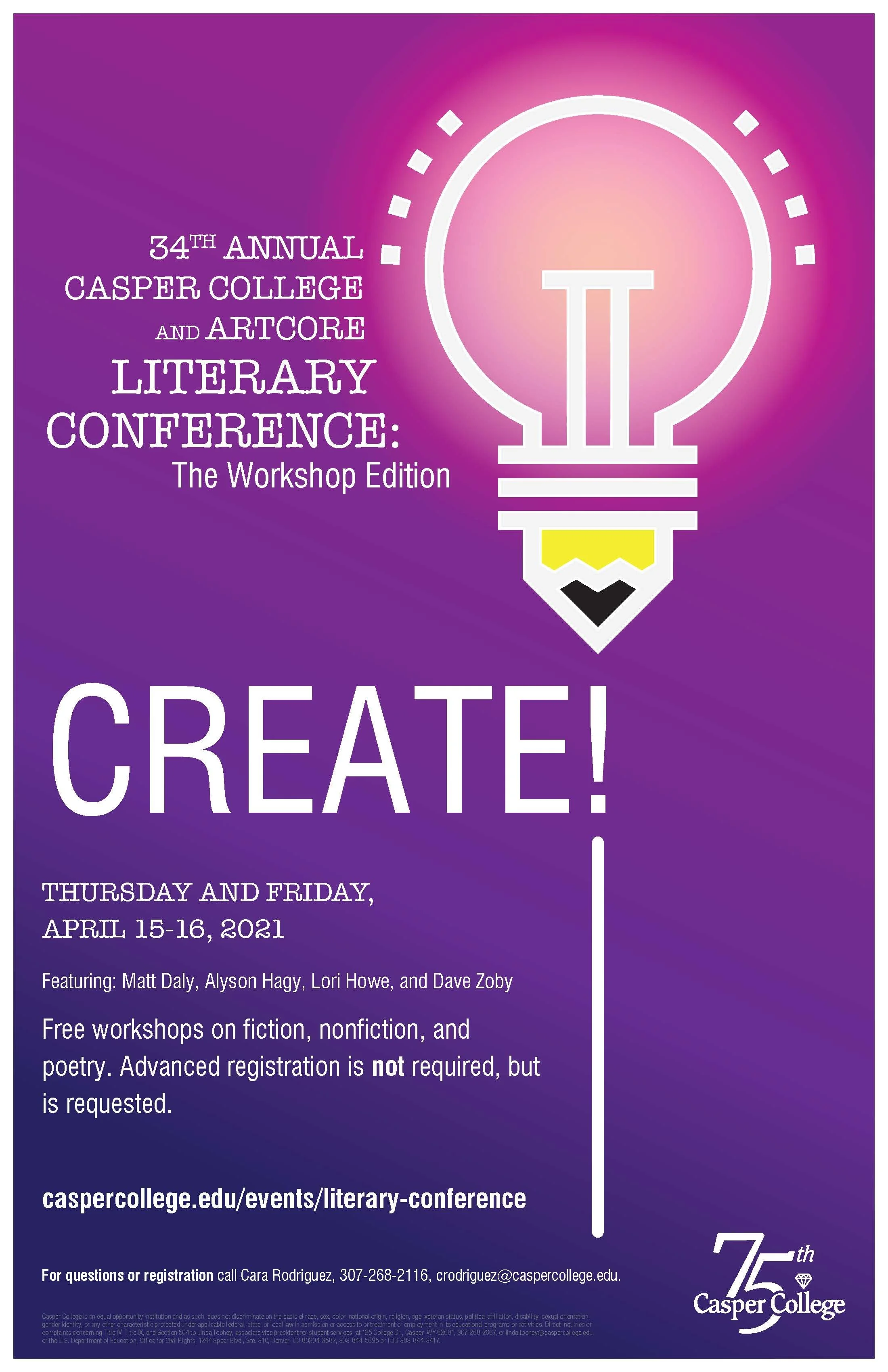
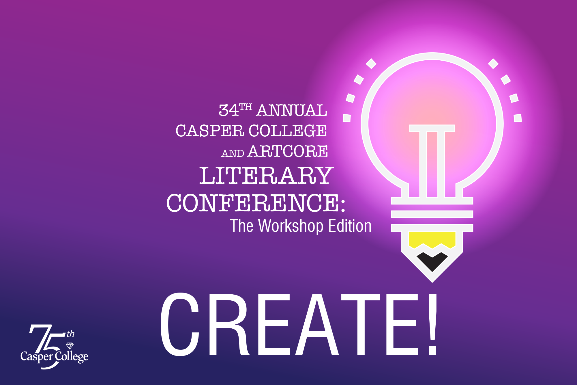
I was given the challenge as with other years to create the look and feel of the program. This year as it was create was a mix of a lightbulb and pencil together
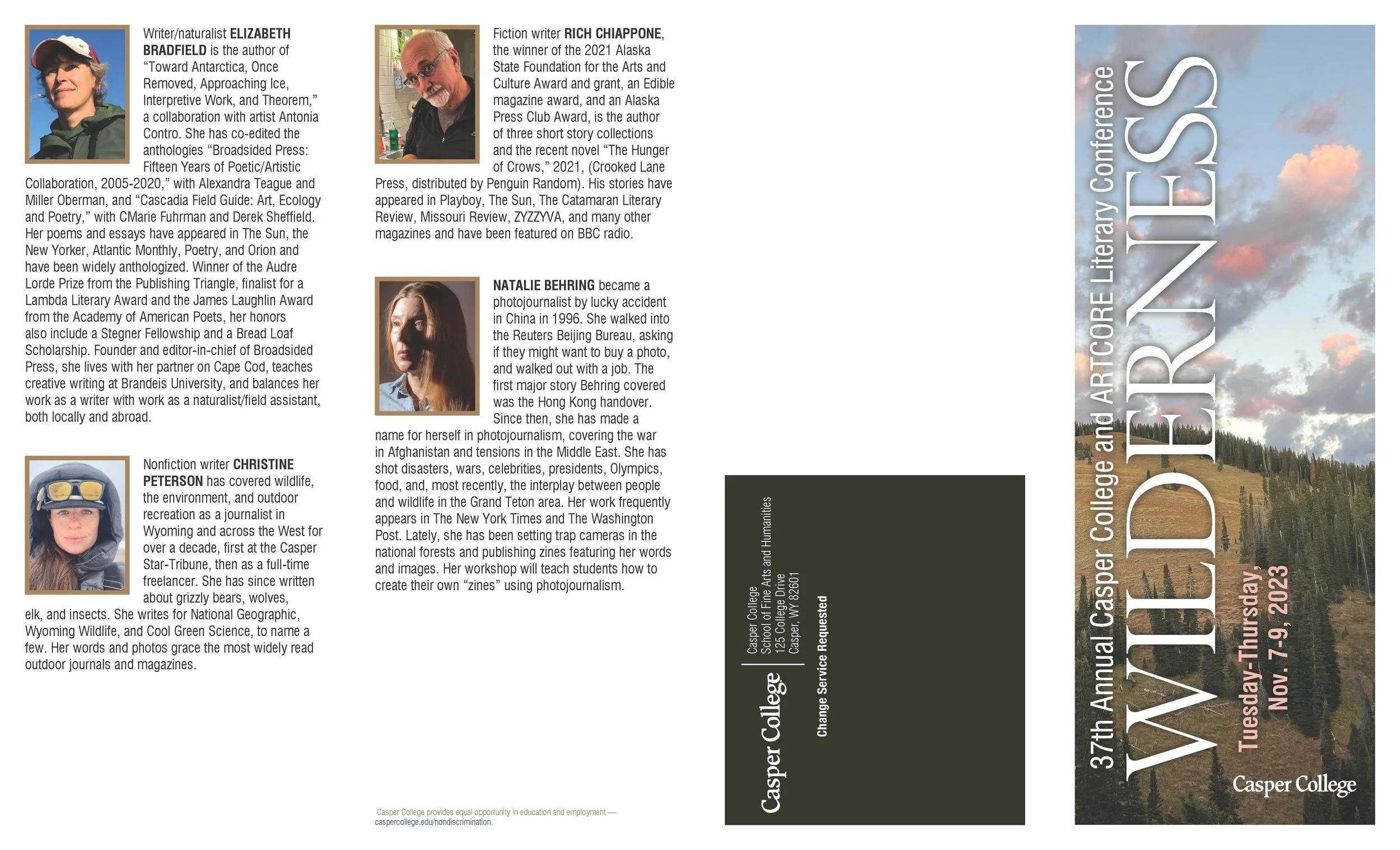
The poster established the visual direction, but that was only the beginning. The same idea had to work across all advertising ... digital, brochure, and other places around the city.
They did not all have to look the same, but needed to feel like they belonged together.
Cohesion is what matters because the audience doesn't experience a brand or event through one piece. The may see the landing page, or the digital post, then later pick up a brochure, and eventually attend the event.
Each interaction should feel familiar and connected to the last.
Different pieces - Different purposes - One experience
The 2022 theme was Good Trouble.
The initial direction suggested was a bridge. It made sense ... a bridge can represent connection, change, or moving from one place to another. But something about it wasn't connecting with the message for me. So I kept brainstorming.
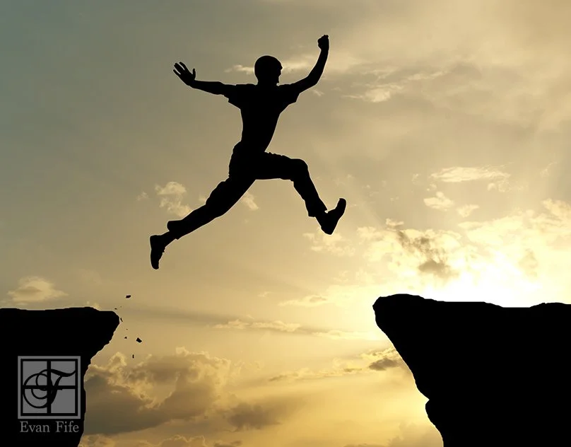
That process eventually led to the idea of taking a leap of faith, stepping forward even when you don't necessarily know where you'll land. That felt much closer to Good Trouble.
It gave the campaign a concept that could tell the story visually, while still giving me a direction I could carry through the poster, advertising, digital pieces, brochure, and postcard.
I think that's one of the things I enjoy most about the creative process. The first idea may be good. The obvious idea may even work.
But sometimes you have to keep asking questions, exploring, and pushing the idea a little further to find the one that really communicates.
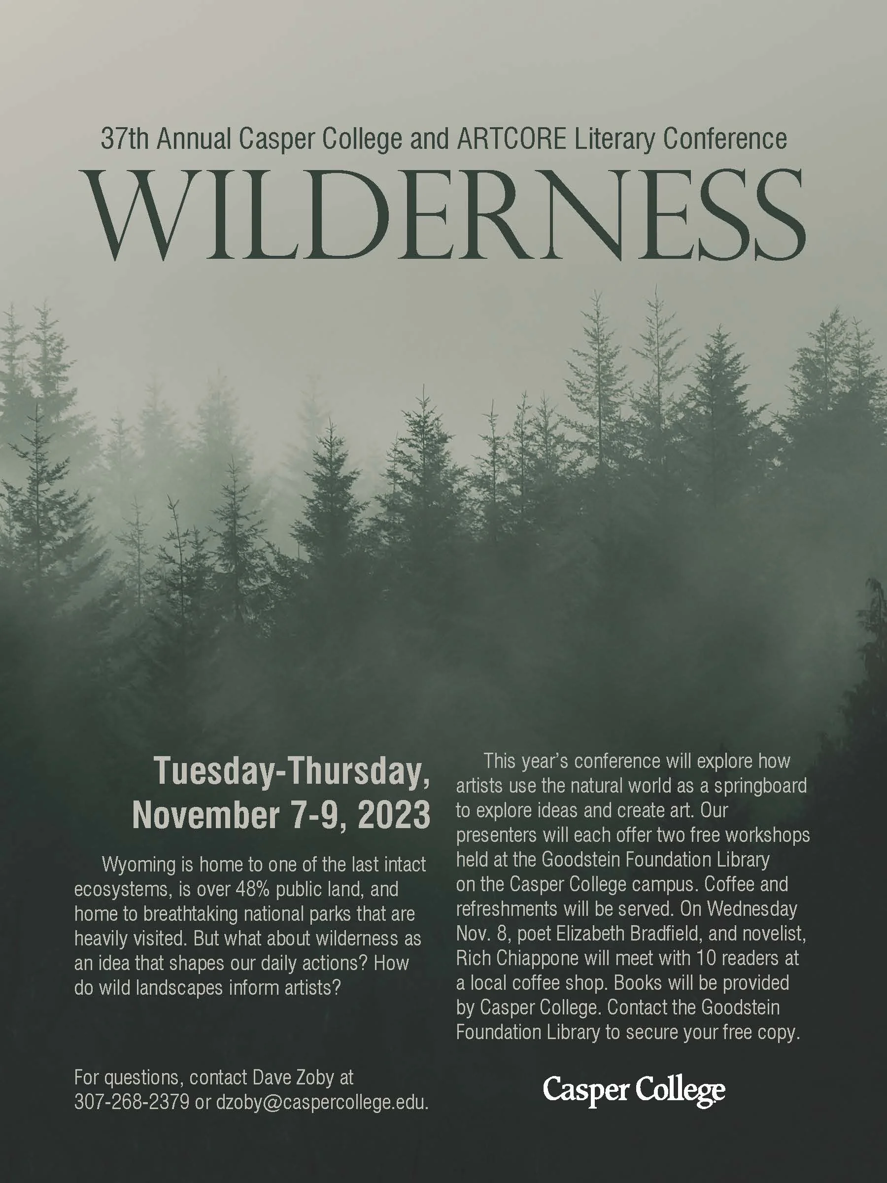
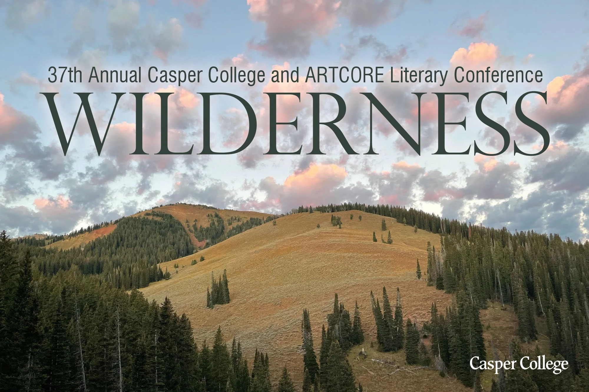
For the 2023 Literary Conference the theme was Wilderness. I started with a forest concept, and a little mystery to intrigue the viewer.
“Wyoming is home to one of the last intact ecosystems, is over 48% public land, and home to breathtaking national parks that are heavily visited. But what about wilderness as an idea that shapes our daily actions? How do wild landscapes inform artists?" Was the basis for the imagery.
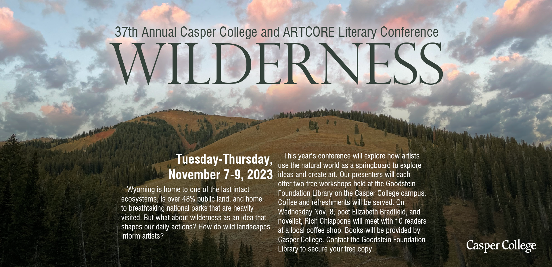
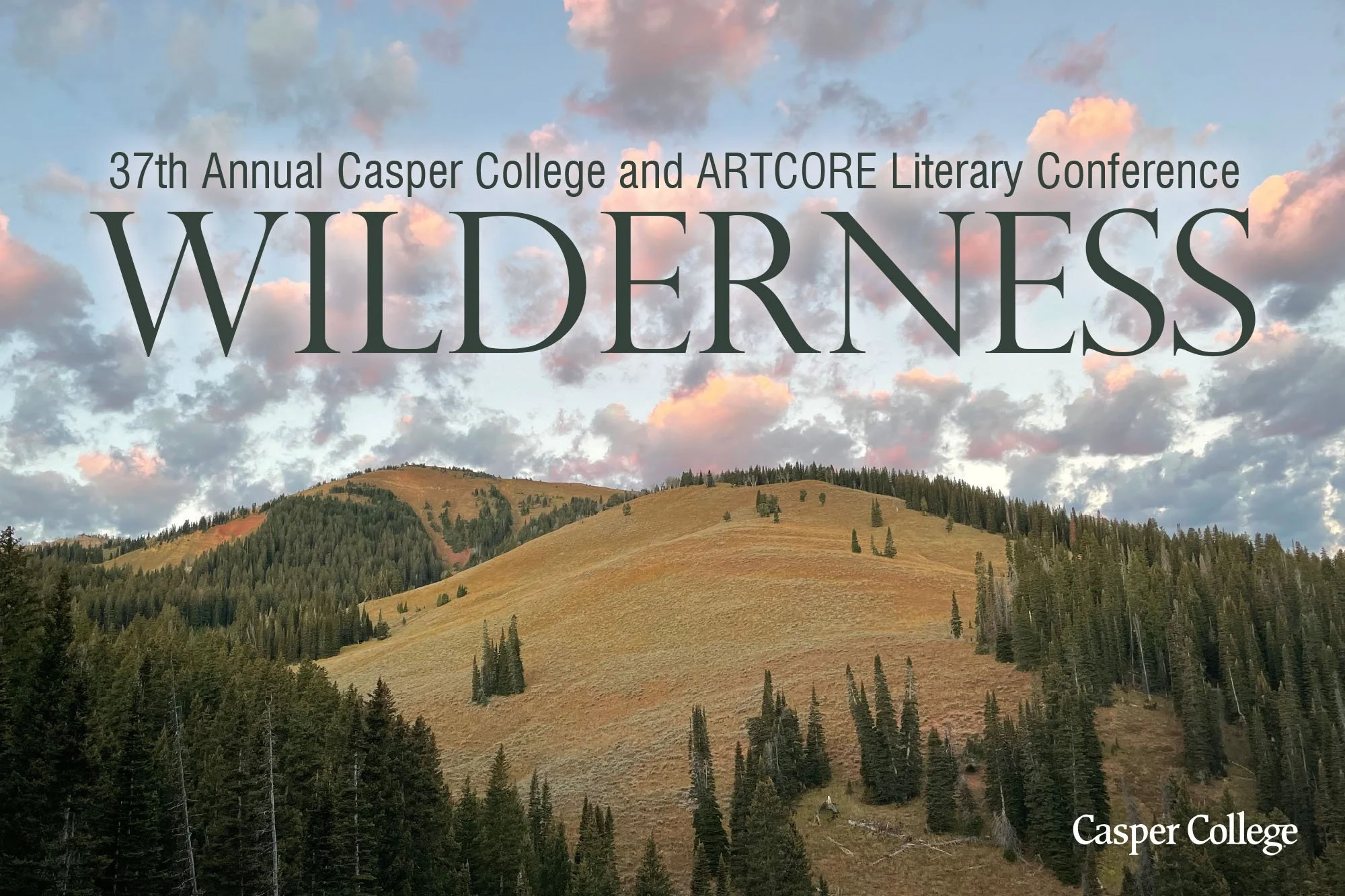
Later the client brought a photography the had taken and wanted used instead.
That meant changing the direction ... and that is okay.
The image would work great, it conveyed wilderness, expanse, and creative.
Collaboration can makes work better. While the initial idea was great, but the two together make the piece stand out even more. Its about working together ... sometimes that defending the decision, others it means pushing the idea farther, or letting go of your idea and finding a better way forward.